VISUAL IDENTITY GUIDE
VERSION 02
MARCH 2018
VISUAL IDENTITY GUIDE
VERSION 02
APRIL 2018
1
VISUAL IDENTITY GUIDE
VERSION 02
MARCH 2018
Welcome
The visual identity guideline outlines the core elements
of our organisation’s brand and how it is applied
to creative documents (ie external documents and
documents created by Internal Communications).
Our organisation’s logo, tree graphic, colour palette
and typeface form the core elements of our visual
brand.
It is important that the brand is applied consistently
across all formal documents, in line with these
guidelines.
Implementation of this guideline is overseen by
Public Affairs & Strategic Relations and Internal
Communications.
Please contact Public Affairs & Strategic Relations
if you need to access the logo or any other design
elements. To access our generic photographic library,
please contact Internal Communications.
All of our organisation’s internal templates reflect the
appropriate visual identity guidelines.
2
VISUAL IDENTITY GUIDE
VERSION 02
MARCH 2018
Logo
Colour
The logo is made of a wordmark and positioning
statement. Both are to appear together at all times as
shown to the right.
The colour version of the logo should be used for
the majority of communication. The reversed (white)
version can only appear on a blue background and on
black when colour is not available. Do not frame the
logo within a rectangle or any other shape.
Reversed (white)
Black
3
VISUAL IDENTITY GUIDE
VERSION 02
MARCH 2018
Clear space, minimum size and placement
Clear space
Minimum size
To ensure integrity and legibility of the logo, clear
space and minimum size restrictions have been
developed.
No other logos, graphic elements or photography
are to appear within the clear space area. The area is
defined by the width of the bold letter ‘u’ in the logo.
30mm
The logo must not appear smaller than 30mm in width.
The logo should be used in the top or bottom corners
of your document (either left or right, depending on
your design). The logo should not appear in the centre
of your design.
Formal crest logo
Stacked
Inline
A formal crest logo is available and should only be
used on formal communication with government. For
example, it is often used by the Chair and where we
would like the reader to be aware we are part of the
Government.
Please contact the Public Affairs Team to determine
whether this logo is appropriate for your needs.
Refer to the Australian Government Branding Design
Guidelines for additional reproduction requirements.
Other logos
Only our logo (and in some cases the formal crest
logo) can be used. You must not create a new logo
for projects, teams, events or other purposes without
agreement from the Internal Communications or Public
Affairs & Strategic Relations teams.
The guide is linked to the brand page on myconnect.
Any questions, please be in touch.
4
VISUAL IDENTITY GUIDE
VERSION 02
MARCH 2018
External documents and documents created
Internal documents
Typefaces
by Internal Communications
For external documents and documents created by
Internal Communications, Helvetica Neue is to be used
for text and DIN used in headings. Standard typeface
weights such as light, regular, medium and bold are
Text
Text and headings
preferred, however all other weights and variations
may be used.
Helvetica Neue
Tahoma
Tahoma is to be used for internal communication and
templates.
Headings
DIN
Example
Example
Main heading – DIN
Main heading – Tahoma
Text heading – Tahoma
Text heading – DIN
General text – Tahoma. lit volorio dolorib
Text heading (optional) – Helvetica Neue
erumquis et volum, atiae que nimet maio cus,
General text – Helvetica Neue. lit volorio dolorib
optaque dellacc event.
erumquis et volum, atiae que nimet maio cus,
optavent.
5
VISUAL IDENTITY GUIDE
VERSION 02
MARCH 2018
Colour palette
Primary
The colour palette is a fundamental component of our
C100/M24/Y0/K64
C52/M25/Y18/K0
C25/M10/Y9/K0
C15/M6/Y4/K0
C9/M4/Y2/K0
corporate identity. It helps to ensure consistent and
R0/G60/B91
R128/G166/B189
R189/G209/B220
R214/G227/B235
R229/G236/B243
coherent communications.
124B69
80A6BD
BDD1DC
D6E3EB
E5ECF3
The primary colour palette comprises of the blue, black
and sand. These colours are the main colours to be
used in all visual communication.
C34/M33/Y72/K0
C28/M28/Y58/K0
C18/M17/Y34/K0
C0/M0/Y0/K100
The secondary colour palette is designed to allow
R173/G154/B98
R189/G171/B125
R212/G201/B171
R0/G0/B0
flexibility in communications such as annual reports,
AD9A62
BDAB7D
D4C9AB
000000
newsletters, and powerpoint presentations.
Colour breakdowns are provided for print (CMYK),
screen (RGB) and web. Breakdowns for lighter shades
are also provided.
Secondary
Refer to the colour contrast chart on page 9 when
C33/M99/Y98/K51
C21/M39/Y100/K0
C76/M40/Y90/K34
C100/M0/Y40/K20
C80/M5/Y5/K15
using these colours online with type to ensure AA
R104/G0/B0
R204/G153/B0
R56/G93/B53
R17/G134/B141
R29/G153/B199
or AAA requirements are met.
680000
CC9900
385D35
11868D
1D99C7
Lighter percentages of these colours can be used.
C21/M100/Y100/K15
C0/M19/Y86/K0
C68/M19/Y85/K4
C70/M0/Y30/K0
C40/M10/Y5/K0
R176/G0/B0
R255/G205/B63
R93/G154/B88
R156/G216/B220
R148/G197/B225
AF0000
FFCD3E
5D9A57
9CD8DC
94C4E1
C0/M11/Y56/K0
C33/M12/Y43/K0
R255/G224/B137
R177/G196/B160
FFDF88
B0C49F
6


VISUAL IDENTITY GUIDE
VERSION 02
MARCH 2018
Colour
Monotone
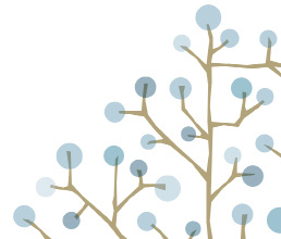
Tree graphic
The tree is designed to provide an additional visual
element to bring materials to life.
It can be used flexibly across communications in
different colours and sizes.
When the whole tree trunk is used, the main trunk
must be shown vertical, as this helps signify growth.
The tree appears within internal templates. Other
creative versions (ie one colour tree visuals) are to be
used only for external communications and documents
created by Internal Communications.
Cropping and colour variations
7


VISUAL IDENTITY GUIDE
VERSION 02
MARCH 2018
Photography
The style of imagery for the organisation is:
• real
• simple
• positive
• relevant.
The imagery selected should:
• show diversity if including people
• only show faces of current employees
• be relevant to the subject matter
• use vibrant and eye-catching colours.
Ensure high quality images are used:
• Do not use low quality, pixelated, grainy
or blurry images.
• Your images should be clean, crisp and in focus.
• If used online, images should have a minimum
DPI of 72.
• If used in print, images should have a minimum
DPI of 300.
Do not use low quality, grainy or blurry
Do not use cliche or inappropriate
Do not use cliche or inappropriate
images.
stock photography.
clip art.
8
VISUAL IDENTITY GUIDE
VERSION 02
MARCH 2018
Colour contrast
Accessibility
Here are some tips to help ensure your publications
Colour type on white
White type on colour
Black type on colour
are easy to understand:
background
background
background
• Use clear, simple language in short sentences.
Small text
Large text
Small text
Large text
Small text
Large text
Less than
Larger than
Less than
Larger than
Less than
Larger than
• Use clear examples that highlight the point you are
18pt regular
18pt regular
18pt regular
18pt regular
18pt regular
18pt regular
making.
or 14pt bold
or 14pt bold
or 14pt bold
or 14pt bold
or 14pt bold
or 14pt bold
• Avoid abbreviations (eg street, not st).
AA
AAA
AA
AAA
AA
AAA
AA
AAA
AA
AAA
AA
AAA
• Use illustrations, diagrams, logos or photographs to
Black
YES
YES
YES
YES
YES
YES
YES
YES
add meaning to the text and improve understanding.
124B69
YES
YES
YES
YES
YES
YES
YES
YES
NO
NO
NO
NO
It is important that any communications you develop
80A6BD
NO
NO
NO
NO
NO
NO
NO
NO
YES
YES
YES
YES
meet our visual accessibility standards:
BDD1DC
NO
NO
NO
NO
NO
NO
NO
NO
YES
YES
YES
YES
• Ensure at least 10 point text (8 point text only when
D6E3EB
NO
NO
NO
NO
NO
NO
NO
NO
YES
YES
YES
YES
referring to source documents and reference notes).
E5ECF3
NO
NO
NO
NO
NO
NO
NO
NO
YES
YES
YES
YES
• Ensure there is a high contrast background.
AD9A62
NO
NO
NO
NO
NO
NO
NO
NO
YES
YES
YES
YES
• Align all text and headings to the left.
BDAB7D
NO
NO
NO
NO
NO
NO
NO
NO
YES
YES
YES
YES
• Do not create sentences and headings in uppercase.
D4C9AB
NO
NO
NO
NO
NO
NO
NO
NO
YES
YES
YES
YES
• Finish a sentence on the page it starts and complete
68000
YES
YES
YES
YES
YES
YES
YES
YES
NO
NO
NO
NO
words on the line they start on.
AF0000
YES
YES
YES
YES
YES
YES
YES
YES
NO
NO
NO
NO
• Use a heading and clear levels of subheadings to
CC9900
NO
NO
NO
NO
NO
NO
NO
NO
YES
YES
YES
YES
help break up information.
FFCD3E
NO
NO
NO
NO
NO
NO
NO
NO
YES
YES
YES
YES
FFDF88
NO
NO
NO
NO
NO
NO
NO
NO
YES
YES
YES
YES
385D35
YES
YES
YES
YES
YES
YES
YES
YES
NO
NO
NO
NO
5D9A57
NO
NO
YES
NO
NO
NO
YES
NO
YES
NO
YES
YES
B0C49F
NO
NO
NO
NO
NO
NO
NO
NO
YES
YES
YES
YES
11868D
NO
NO
YES
NO
NO
NO
YES
NO
YES
NO
YES
YES
9CD8DC
NO
NO
NO
NO
NO
NO
NO
NO
YES
YES
YES
YES
1D99C7
NO
NO
YES
NO
NO
NO
YES
NO
YES
NO
YES
YES
94C4E1
NO
NO
NO
NO
NO
NO
NO
NO
YES
YES
YES
YES
9
VISUAL IDENTITY GUIDE
VERSION 02
MARCH 2018
Charts and graphs
Pie charts
The following colour spectrums are recommended
Single colour
when creating graphs and charts. Try to select colours
in order from either side of the spectrum.
The colour order for graphs is intended to have
Colour
increased contrast.
Graphs
Single colour
Colour
10


VISUAL IDENTITY GUIDE
VERSION 02
MARCH 2018
Incorrect use
Examples on this page show incorrect ways of
reproducing the logo and brand elements.
If you are unsure, please contact the Public Affairs
Team to determine whether you are using the brand
guidelines correctly.
Do not separate the logo and
Do not reproduce the logo in or place
Do not alter the proportion or rotate
positioning statement.
on a different colour.
the logo.
Do not attempt to recreate the logo or
Do not frame within a rectangle or any
Do not infringe upon clear space.
alter the typefaces.
other shape.
Do not apply any effects such
Do not use a low resolution or blurred
Do not place the logo over a high
as a drop shadow.
version.
contrast image.
11